 This article has a talk page!
This is a sub-page of Paper Mario: The Thousand-Year Door.

|
To do: |
Characters#
Mario#
|
|
To do: |
|
Early |
Final |
|---|---|

|

|

Very early graphics of Mario appear in the p_hune files. The earlier graphics have a thinner outline, much softer colors, and a black mustache. They are clearly based on the first game.
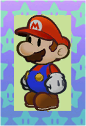
A near finalized version of Mario appears in the p_b_st, p_bibi, p_kaiten_h, p_slit, t_dokan, t_kaiten_h, and t_p_yokeyoke files. Main difference is the darker color scheme, boots being more round and slightly bigger, and a star-patterned background.
Admiral Bobbery#
|
Early (c_bomt) |
Final (c_bomt_n) |
|---|---|
|

|
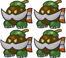
Admiral Bobbery started out with a completely different design -- as a soldier! This design also appears in concept art included in the Nintendo Switch remake, though with a blonde mustache and camo shoes instead of a silver mustache and solid green shoes.
Vivian#
|
|
To do: |
|
Early |
Final |
|---|---|

|

|
File Name: tst_vivi
This design of Vivian is almost identical, save for the flame on the tip of her hat. Concept art included in the Nintendo Switch remake reveals that the Three Shadows were going to have tassels on the ends of their hats corresponding to their elemental attacks, though corresponding sprites for Beldam and Marilyn are not present in the game's data.
Goombella#
|
Early |
Final |
|---|---|

|

|
File Name: menu_party
The file menu_party contains duplicate graphics for most partners in the game, except for Vivian. While they are mostly identical, Goombella's shoes have visible soles in these sprites. This lines up with her appearance in many early screenshots and pre-release material, in which all Goombas had visible soles. For unknown reasons, Goombella's trophy in Super Smash Bros. for Wii U uses this preliminary design.
Enemies#
Mystery of the Smorg#
File Names: test_bom (Earliest), c_moa_a, c_moa_b (Early), c_n_moa_a, c_n_moa_b (Final)

The Smorg enemies are more interesting than they appear. This early Smorg design is found in the file test_bom, dated October 7, 2003. It is referred to as test_h in the file.


These two odd creatures are in files c_moa_a and c_moa_b, respectively. Their files are also dated October 7, 2003.

So what's the connection? Well, the Japanese name for the Smorg is Moamoa. Theory: these creatures were the original designs for the Smorg, not the enemy found in test_bom.


The final Smorg designs appear in files c_n_moa_a and c_n_moa_b. These are dated later than the previous moa files, at January 8, 2004 and December 17, 2003. Inside the files, the enemy is referred to as new_moa! This concretes the previously stated theory.

So what happened to the old Smorg design? It was used for Screamy, one of Luigi's partners. Perhaps the staff just wanted to use the old design somewhere in the game.
As for what the enemy in test_bom was originally supposed to be, that's still a mystery.
Koopa Troopa#
|
|
To do: |
|
Early (nokoteki) |
Final (c_nokoteki) |
|---|---|

|

|
Another very early design. Like the Mario graphics above, this has duller colors and a thinner outline.

This shell is stored as a separate image. For some reason, the transparent area is filled with garbage pixels.


These wings are present as well. These look like the wings used in the first Paper Mario.
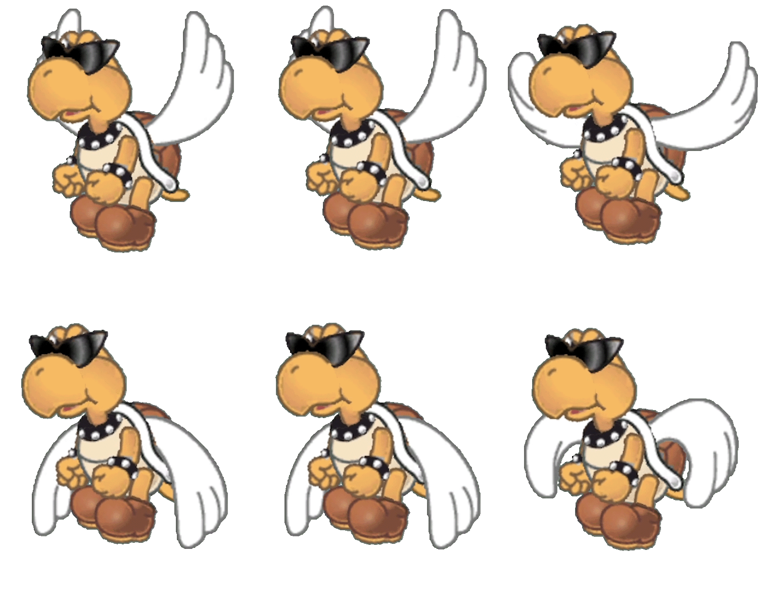
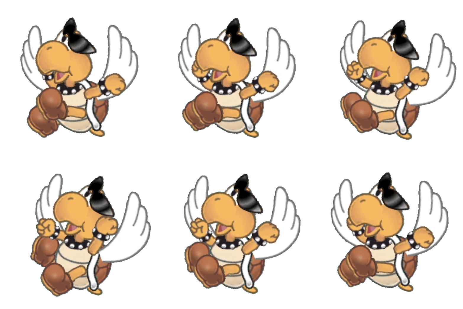
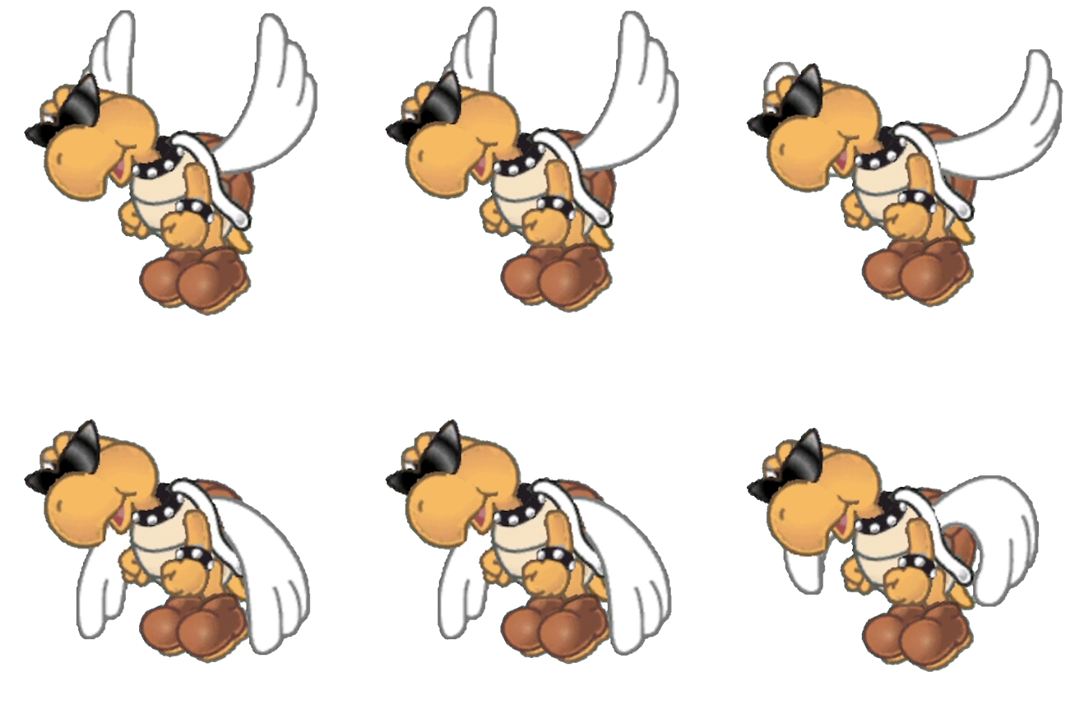
Animations for a Paratroopa can be found by loading patapata
Items#
All early item graphics are found in the test_item file.
Key Items#
|
Early |
Final |
|---|---|
|
|
|


The Sun and Moon Stone items use a rocky texture that was removed in the final version. Strangely, when the stones are put into the rock columns in the final game, they use the early graphics!
|
Early |
Final |
|---|---|

|

|
A similar rocky texture is present in the Star Key too. This item also lost its eyes in the final game.

This key doesn't directly correspond to any key used in the final game. The color and design make it resemble Hooktail's head.
Thrown Items#
|
Early |
Final |
|---|---|

|

|
The can uses duller colors and is slightly bigger.
|
Early |
Final |
|---|---|

|

|
This painful brick was changed to a harmless stone. Wait.
Battle Menu#
Battle Icons#
|
Early (audience.tpl) |
Final (icon.tpl) |
|---|---|
|
|
|


Larger, more cartoonish versions of the battle menu icons. These icons were shrunk from 64x64 to 48x48.
|
Early (menuwin.tpl) |
Final (battle_common.tpl) |
|---|---|
|
|
|


Same as above. The early cursor graphics only have one frame of animation. Cartoonish graphics? Yes. Does this description even need to be here? Probably not.
|
Early (menuwin.tpl) |
Final (battle_common.tpl) |
|---|---|

|

|
Slightly earlier graphics for the switch icon. The earlier graphic resembles the actual GameCube controller more.
|
Earliest (audience.tpl) |
Final (battle_common.tpl) |
|---|---|

|
|
An even earlier version can be found in audience.tpl. Switching was done with the L Button in an earlier version.
Character Icons#
|
Early |
Final |
|---|---|
|
|
|


More test_item graphics. Early graphics for the icons used on the Partner Switch menu. The early version just seems to have shrunk down character sprites, while the final version's graphics are custom made for this screen. Bobbery is still using his early soldier design. Both the early and final icons depict Goombella wearing her scrapped shoes.
|
Early |
Final |
|---|---|
|
|
|


As before, the final version uses unique graphics for health icons. These early icons are facing left and don't have hearts.
Action Commands#
|
Earliest (menuwin) |
Final (icon) |
|---|---|
|
|
|


The earlier buttons here are larger and are more based on the first game's button designs.
|
Earliest (menuwin) |
Final (icon) |
|---|---|
|
|
|


Like the buttons above, the control stick graphics are a bit larger. They were also updated to more closely resemble the controller's analog stick.
|
Earliest (menuwin) |
Final (icon) |
|---|---|
|
|
|


The shines on the three action lights were turned from yellow to white, and the shading was changed on the action command prompt.
|
Earliest (menuwin) |
Final (icon) |
|---|---|
|
|
|


The run bar was reshaded and the run meter was made a bit brighter in the final version.
Miscellaneous#
Ability Icons#
|
Early |
Final |
|---|---|
|
|
|


Also found in the test_item file. The ability icons were redone for the final version. The paper is yellow in the early graphics but white in the final game.
Glitzville#
Some early graphics can be found in file tou_00. These textures are used in the tiny model of Glitzville that appears in the blimp ride sequence, but are normally too small to be seen.
(Source: Supper Mario Broth)
|
Earliest (tou_00) |
Final (tou_01) |
|---|---|

|

|
Early design of the Fire Flower used to mark shops. The older design does make an appearance at Westside Goods.
|
Earliest (tou_00) |
Final (tou_01) |
|---|---|

|

|
|
Earliest (tou_00) |
Final (tou_01) |
|---|---|

|

|
A different romanization of ウーロン街, the town's Japanese name. The older textures use the Japanese interpretation "Uron" rather than the Chinese "Oolong".
Starman#
|
Earliest (hoshi) |
Final (hoshi_2) |
|---|---|

|

|
An earlier, more animated version of the message prompt. The final version leans left and right. This was also used in the early trailers for the game.

Strangely enough, this pointer was grouped with the early Starman. It's similar to the early pointers in the battle icons, although with shading.
Early Font#
Early |
Final JP |
Final US/EU |
|---|---|---|
 |
 |
 |
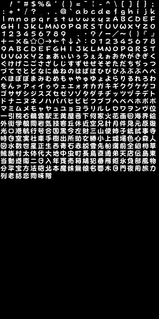
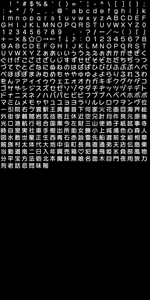
The Japanese version's font folder contains an early font called popjoyB22.bfn. It is named after the commercially-available font that it and the international font are based on. It is used in the "Interactive Multi-Game Demo Disc - Version 18 (USA)" demo.
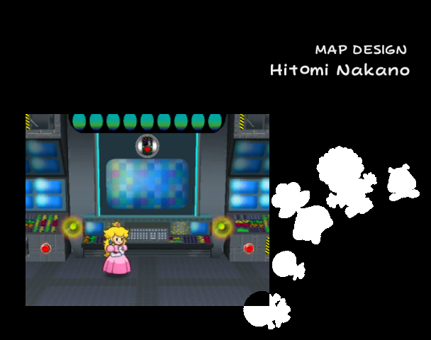
Oddly, the end credits in the Japanese version uses Latin characters. The font found in the international release is used instead. For an unused prompt, the other font is used. It might be using the differently kerned font found in the demo.
|
Japan |
International |
|---|---|
|
|
(Source: Original TCRF research)