 This article has a talk page!
This is a sub-page of Proto:Sonic Heroes/GameCube prototype 10.8.

|
To do:
|
While certain graphics were unchanged from the 9.28 prototype, this build does contain some differences that weren't previously a thing before.
Save File#
Prototype 10.8 |
Final |
|---|---|
 |
 |
 |
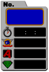 |
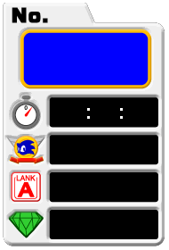
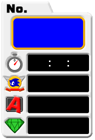
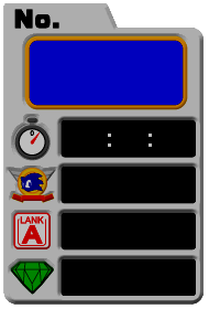
The A Rank texture is completely different, and it's shown as LANK'' instead ofRANK, which still uses the early design from the 9.28 prototype. WhileAwas changed and kept in the final,RANK'' was not.
Main Menu Buttons#
Prototype 10.8 |
Final |
|---|---|
 |
 |
 |
 |
 |
 |
 |
 |
 |
 |
 |
 |
 |
 |
 |
 |
 |
 |
 |
 |
 |
 |
 |
 |
The curve lines on the top-left of the main menu buttons were removed. The most notable difference is that the "Options" menu button in English became singular, despite already having the finalized text in the options menu itself. The curve lines were added back and the "Options" menu button graphic was restored in the final.
Super Hard Menu Button#
Prototype 10.8 |
Final |
|---|---|
 |
 |
 |
 |
The English version of Super Hard mode's "D" text for the menu button is seen cut off.
Stage Icons#
Robot Carnival/Storm and certain levels in 2P mode shown below now have a "TEMP" text on the bottom-right screen, despite not previously being the case. Note that the Turtle Shell level when it's unselected uses Ocean Palace's stage icon instead, and the name for Casino Course is misspelled.
1P#
Prototype 10.8 |
Final |
|---|---|
 |
 |
 |
 |
2P#
Prototype 10.8 |
Final |
|---|---|
 |
 |
 |
 |
 |
 |
 |
 |
 |
 |
 |
 |
 |
 |
 |
 |
 |
 |
 |
 |
 |
 |
 |
 |
 |
 |
 |
 |
 |
 |
 |
 |
 |
 |
 |
 |
Game Data#
|
Prototype 10.8 |
Final |
|---|---|

|

|
Game Data is still seen capitalized in this build, like the 9.28 prototype.
Anti-Flicker#
|
Prototype 10.8 |
Final |
|---|---|

|

|
Anti-Flicker was originally called Deflicker.
Team Select#
Prototype 10.8 |
Final |
|---|---|
 |
 |
 |
 |
 |
 |
 |
 |
 |
 |
 |
 |
The backgrounds and the text for Team Rose and Team Chaotix are colored yellow and purple for Cream and Espio respectively, instead of being colored pink and green for Amy and Vector like in the final.