 This article has a talk page!
This is a sub-page of Proto:Quake (PC)/Qtest1.
Graphics#
Player#
The biggest difference between the QTest1 and final versions of the player model is the animations.
- First, there are no axe animations, but that's to be expected as this prototype has no axe.
- Second, the qtest1 version has no muzzleflash.
- Third, there are three animations which were removed from the final game. It's unknown if they were actually implemented or not in the build.
|
Prototype |
Final |
|---|---|

|

|
The model's textures also possess differences. No axe or muzzleflash as expected, but also less detail in the armor and on the gun, no camo texture or pockets on the pants, less defined arms, lighter color boots and head, and some very small purple highlights on the helmet. Another thing to note is that the tip of the gun is positioned slightly below where final is, and thus the gun's barrel appears as closed. You can see that in the muzzleflash picture above.
|
Prototype |
Final |
|---|---|

|

|
An interesting thing to note is that the final version has some wrongly colored pixels around Ranger's neck, and don't turn the proper color using multiplayer's color feature, while QTest1's version doesn't have that problem
|
Prototype |
Final |
|---|---|

|

|
Gibs#
Two of the gib models have changed between Qtest1 and the final game; the "chest" and "head" gibs. The chest gib is based on the player's model's armor in Qtest1, while the final one is based on a bare chest. The head gib has been changed from having baby blue eyes to more realistic-looking ones. The helmet also changed a bit.
|
Prototype |
Final |
|---|---|

|

|
|
Prototype |
Final |
|---|---|

|

|
HUD#
The HUD is completely different compared to the one in the final. It uses a different font, background and layout (no space for the runes/keys/items). Even the multiplayer scoreboard is different between Qtest and the final; frags are displayed at the bottom of the HUD, while the final has a unique display that appears on the center of the screen when scoreboard is activated.
Of note is that, no matter how much damage the player takes, the HUD face will never change. There are no different faces either, so it seems that the HUD face wasn't fully implemented at this stage.
|
Prototype |
Final |
|---|---|

|

|
|
Prototype |
Final |
|---|---|

|

|
Console Texture#
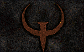
Qtest1's console uses a completely different texture compared to the final's and there's no ID Software trademark.
|
Prototype |
Final |
|---|---|
|

|
Alternate HUD#
Tiles for an alternate HUD can be found hidden in gfx.wad. It uses the same design the Qtest1 HUD uses, but has a different background and font.
Main status bar. |
 |
Inventory screen. |
 |
Scoreboard background. |
 |
|
In-game HUD font |
Unused HUD font |
|---|---|

|

|
Font#
In Qtest1, the console uses a different font compared to the final's console. Interestingly, this font reuses Doom 64's status bar font, which is HIGHLY notable as id Software did not make Doom 64 (besides Gregor Punchatz, who was the modeling artist, and his father was the artist behind the iconic cover of the original Doom). Additionally, this raises the question of where this font design originated from which game, as Quake was released in 1996 and Doom 64 was released in 1997. It is possible that id Software may have created this font first and Doom 64 reused it later, or the other way around being Midway created the font design and id Software reused it from their resources. Both games were being worked on at this time, and id Software were supervisors of Midway for Doom 64's development (as it's id Software's IP), so it's very unclear of where the origin comes from. Who knows.
In addition, the texture that has the console font has a strange looking dirt/metal and stone texture under it. In the final release, the stone has been replaced with a brownish orange version of the font.
|
Prototype |
Final |
|---|---|

|

|
Teleports#
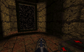
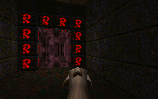
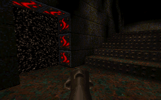
Teleports use the skybox in Qtest1, while the ones in the final use a texture that is used only for teleports.
|
Prototype |
Final |
|---|---|

|
|
|
Prototype |
Final |
|---|---|
|
|
Palette#
At this point, the palette hadn't been finished yet, with one row of colors, plus other two, being completely white.
|
Prototype |
Final |
|---|---|

|

|
Sprites#
Qtest uses a lot more sprites compared to the final version. Items like torches are sprites instead of models, and there are a few sprites that do not exist in the final version at all.
Teleport#

A sprite animation is used to indicate that a person has used a teleporter, instead of the final's particle effects. Interestingly enough, these sprites were still in use in Beta3, showing they were replaced at the last minute. The sprites are actually taken from Doom, however the palette conversion isn't very good, resulting in the originally white and yellow center becoming black and light orange.
Torches#
There are a ton of unused torch sprites hidden in the game's files. Only one of them is actually used in Qtest1.


Statue#
Two sprites of a gargoyle statue can be found; one with a torch, the other without.


Orb#
The strange orb seen in the underwater section of the final's E4M7 is in Qtest1, but has an animation of it exploding (once again using poorly converted Doom sprites) for some reason. This animation does not exist in either Beta3 or the final game.


Bubbles#
The air bubble sprite has two extra frames that went unused in the final game. A single blue pixel and a... fish? There also exists a second frame of animation for the fish moving it's fin.

