 This article has a talk page!
This page details pre-release information and/or media for Game & Watch Gallery 4.
Title Screen#
|
Prerelease |
Final |
|---|---|
|

|
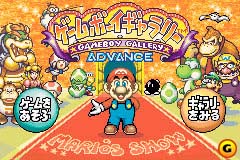
A screenshot of an early Japanese title screen exists. The Japanese Virtual Console release of the game calls it "Game Boy Gallery 4", similar to the US release.
There are various differences between this Japanese title screen and the final version, including:
- There was no copyright.
- The Goonie was bigger.
- Yoshi's head was shifted more towards the right.
- The baby Yoshi was moved more to the right.
- The Toads were redrawn.
- Lakitu was moved over a little.
- Luigi's hand was different.
- Wario's head seems to be slightly overlapping Luigi's in the final.
- The bird on the top-left corner of the final screenshot does not appear in the prerelease version.
|
Prerelease |
Final |
|---|---|
|

|
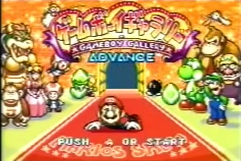
"PUSH A OR START" was changed to "PRESS A BUTTON OR START" in the final.
Game Select#
|
Prerelease |
Final |
|---|---|
|

|
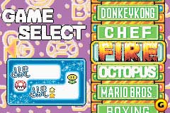
Lots of differences.
- The prerelease version has no bricks.
- Different background (the "GBG" and dot are still in the game, albeit unused).
- The "GAME SELECT" font is different.
- The logos are different.
- The star counter has sparkles.
|
Prerelease |
Final |
|---|---|
|

|
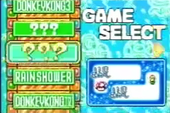
The menu colors were swapped in the final, and it seems Rain Shower, Donkey Kong 3, and Donkey Kong Jr. were initially unlockables before becoming playable from the start in the final.
|
Prerelease |
Final |
|---|---|
|
|
|


Along with Fire, several games had different logos in the prerelease.
Modern Rain Shower#
|
Prerelease |
Final |
|---|---|
|

|
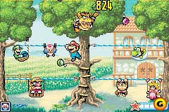
- Mario looked more like his Super Mario World sprite.
- Bowser had no pupils and a different hand gesture.
- Luigi's hat had a longer rim.
- Toad's head had a different pattern.
- Peach's head was redrawn.
- Donkey Kong Jr. had a different pose.
- Wario's face was thicker.
- The star was replaced with a moon.
Modern Donkey Kong 3#
|
Prerelease |
Final |
|---|---|

|

|
Mario looked exactly like his Super Mario World sprite, and Donkey Kong had more of a smirk.
Modern Octopus#
|
Prerelease |
Final |
|---|---|
|

|
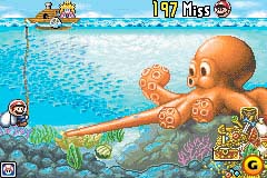
- Mario, once again, looked more like his Super Mario World sprite.
- Mario's mustache looked more like a crazy grin than a mustache.
Of note, Mario's early sprites are actually still in the final game, used in the animation played on the menu when Octopus is highlighted.

Modern Donkey Kong#
|
Prerelease |
Final |
|---|---|

|

|
- Mario's sprites were completely redrawn.
- The Mario life icons were different.
- Peach was completely redrawn.
- The Parakoopa looked more like its sprites from Super Mario World.
Three sprites of the early Mario still remain in the final game.
Modern Donkey Kong Jr.#
|
Prerelease |
Final |
|---|---|
|

|
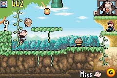
- Donkey Kong Jr.'s life icons were redrawn.
- Mario's sitting sprite was different.
- The vines had black outlines.
- The scenery was more green as opposed to blue.
- The tree had much less detail.
Modern Fire#
|
Prerelease |
Final |
|---|---|

|

|
Mario and Luigi were shorter and had black shoes.
Modern Mario Bros.#
|
Prerelease |
Final |
|---|---|
|

|
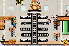
There were black splotches on the bricks, and the cakes were bigger.
Classic Boxing#
|
Prerelease |
Final |
|---|---|

|

|
"GAME A" and "GAME B" were in a different font.
(Source: Random Hoo Haas)