This article has a talk page!
This is a sub-page of Development:Doom (PC, 1993).
This page contains the development of the game screens, UI, and the face of our main character we all know and love known as Doomguy.
Unnamed Marine / Doomguy#

title screen art of B.J. Blazkowicz, further establishing the connection that Doomguy was based off of the Nazi slayer.]]
Graphic |
Description |
|---|---|
 |
Yes, it's Doomguy! It's a very early design of him, but recognizable. id Software seemed to have experimented with a more animate face with the idle, active shooting, evil grin, and sidestep "ouch" faces. Each different branch has more expressive frames of animation than the less animate face in the release. And the last one on the lowest bottom right? Well... uhh... Maybe also an "ouch" face...? Who knows. |
 |
This sheet shows experimentation with different types of players, akin to The Doom Bible's idea, or a settle on a familiar design basis for where Doomguy should head (ba-dum-psh). The first two sprites are recognizable, but do notice the different hairstyle and the second variation showing visible armor. The second set of faces show what we consider "Doomguy," but he also has a visible neck. A third different-looking Doomguy with a more slender face and glasses is seen. The fourth set shows a dark-skinned Doomguy with a large Afro hairstyle, with the second iteration bearing sunglasses and a comb or brush, in a comedic fashion, stuck in his hair. It's worth noting that a dark-skinned player named "John Pietrovich," or just “Petro” was described in those aforementioned design documents for the game. However, his description of "balding" doesn't match with these two HUD sprites with the Afro hair. |
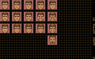 |
id Software decided Doomguy should have short brown hair, and applied it to the other sprites (seen from the first sheet) along with other modifications and new faces. The looking animation was also dumbed down a bit, the evil grin and active shooting animations were lengthened, the sidestep "ouch" animation was removed from the sheet, and the presumably and derpy "ouch" face was replaced by the more iconic one. Each frame of animation (minus the "ouch" face) has 5 frames of animation. In the final release, the transition between faces is more abrupt and the looking sprites only have three frames instead of five. However, it looks as if the more "pointed" looking faces were visibly repurposed for a damaged variant of the animation later on. |
 |
Frame 1 of looking around, evil grin, and active shooting respectively. All of them are using the default idle face, as it was a common transitional frame between the other animations. |
 |
Frame 2 of looking around, evil grin, and active shooting respectively. |
 |
Frame 3. Ditto. |
 |
Frame 4. Ditto. |
 |
Frame 5. Ditto. |
 |
This sheet shows the amount of possible different damage states Doomguy can have. Do note there are six damage states here instead of the usual five in the game. The last one is supposed to be upon death, but the eyes aren't closed... or maybe this sheet wasn't finished and this was supposed to be the column for the seventh damage state (seen next). The third damage state seems to the choice for the default full health state later on, but do note its sprites aren't quite finished, still. |
 |
Now, there are seven damage states. Most of these faces were polished up and used for the final sprites. All of these damage states were likely cut down to reduce space for the game, and eventually id Software settled on only five damage states. |
HUD#

|
To do: |
Tom Hall vs. John Romero. Fight!
Alpha Visor View#
You are a [space] marine, so you will see as if you were a [space] marine... right...? The visor HUD design had a few changes before it was completely axed out of the game in favor of the stone HUD. It was only a matter of time anyway, because plenty of vintage shooters before Doom already had a display similar to this design. id Software later thought less is more and cut ti down so that more of the environment in the game could be seen.
Graphic |
Description |
||
|---|---|---|---|
 |
To reiterate from the mainline development page, the visor HUD was made to be "realistic" to how the player would see as if they were an actual space marine based on The Doom Bible. There were a ton of active stats on the screen that would change based on the player's health, armor, items, automap, etc.). The stats displayed are:
|
||
 |
The small HUD text was anchored a bit. |
||
 |
The player speed, armor, and health stats were given a shine and have icons instead of letters. The shotgun text was changed to the "Missile launcher" for some reason, along with the early UAAF [and not to be confused with the UAC] logo |
||
 |
Most of the the shine was removed from the player stats. The shotgun text was brought back, but now instead of the UAAF logo, there are two light bars above the weapon text. The ammo count text was also made thicker and given a little bit more detail. Additionally, text bullet points were added onto the message status bar. This was the last completed graphic of this type of HUD before it was canned in favor of the more minimal, status bar view. |
||
 |
The weapon sprites for the helmet HUD. |
||

Status Bar#
Again, in more ways often than not, less is more. The way it was done was very inchoate, however.
Graphic |
Description |
|---|---|
 |
This is a revision of the visor view style of HUD that fits at the bottom of the screen rather than overlapping the view. This style was added in prototype version v0.5. |
 |
id Software gave in and completely axed the technological design choice that Tom Hall wanted, and went with a more Wolfenstein 3D approach to the UI by recoloring that UI style to be red instead of blue (not only as a placeholder, but probably to contrast between the games), but also adding more types of UI elements to accommodate the game. Notice how there are extra tabs, such as "SCORE," "WEAPONS," and an extra tab with a dividing section. The score section was meant for picking up bonus items, which did nothing but increase score. The weapons tab was for the weapons you currently had in your inventory. Notice how the weapons are completed and were downscaled for the weapons tab. The score and weapons tabs were connected together and only featured when the automap was active. The tab with the dividing section was for any message text, item pickups, new weapons, ammo, powerups, etc.). All of this is seen in the press release pre-beta. There are a few number font text: white, yellow, orange, small red, small yellow, and a unique style akin to the game's logo. The small yellow number font was used for the inventory ammo count, and the small yellow system font following after would display for status messages. Lastly, the inventory ammo count tab has the "MISS" (later "RCKT," rockets) and "CELL" have their positions swapped. |
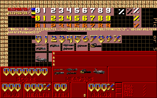 |
This is how the HUD would look with the text placed in. It really does look like Wolfenstein 3D. The global yellow font was shifted around a bit, and the logo-stylized 7 was updated to be a little bit bigger. |
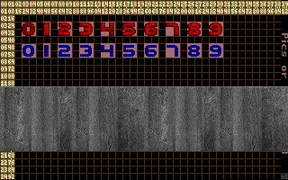 |
The early process of replacing the red HUD with the iconic stone style. The font is almost done, and there is also a blue version that wasn't used. |
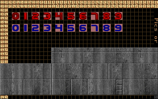 |
Divisors were added to differentiate the tabs, along with the addition of the message tab. |
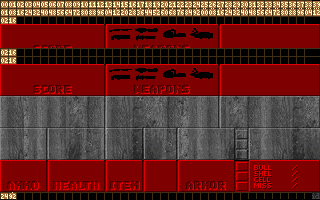 |
Alignment checking. |
 |
Ammo counters addition. |
 |
Signature solid red HUD font addition. The incomplete blue variant of the big counter font was removed after this sheet. |
 |
The tab name font was set in stone (ba-dum-psh). The big counter font was detailed a bit more and aligned into smaller cels, along with the addition of a percentage. The message status tab was also cut down partially to align with the weapons and item tabs properly. |
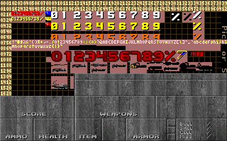 |
Regrouping and final touches for the press release pre-beta. An early style for the base keys can be seen as well. |
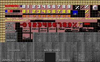 |
Afterwards, id Software went back and added the "ARMS" tab in place of the "ITEM" tab and removed both the item and weapons tabs, along with the small weapon icons from the game, and would remain unused in the game until v1.2 where the graphics were removed. The messages tab would also remain unused in the game until that same update. In the meantime, the item tab was replaced by "FRAGS" for multiplayer. There is also an "ARMGS" tab name, but this might be a sloppy mistake from a developer pasting in "ARM" with the "FRAGS" tab name, as they both share the same spot. The big counter font now has a negative symbol, which is very odd considering it's not possible to go into the negatives on any of the counters either in the HUD or on the intermission screen, unless extremely buggy circumstances cause any of the counters to become negative for whatever reason. Another imperceptible chance with the big counter font is that the text thickness was reduced. Maybe this was so that the text can be read better? Who knows. A bunch of other stuff such as the base keys were updated to the completed sprites, alongside the addition of skull keys. At the inventory ammo count, the "MISS" (missile) counter was finally changed to "RCKT" (rocket), and so was the depleted ammo font added. The floppy disk and CD icons were added, the middle of the HUD was carved out for Doomguy, and two yellow dots were placed near the word "PIC" for some reason. |
Font#
id Software really couldn't make up their minds about what font to use or what style, and oh boy, a lot of it is unused!


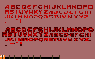
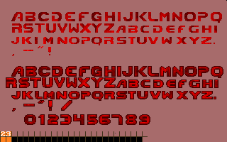
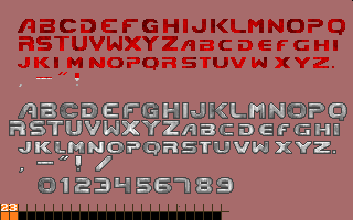
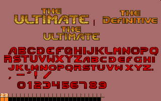
Several of these different font styles were used in various prototypes, and eventually morphed into the text we know and love.
Screens#
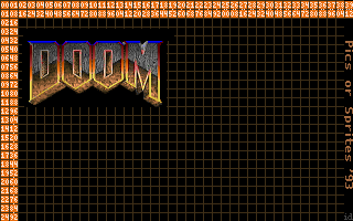
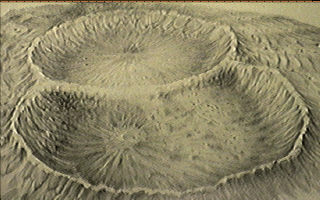
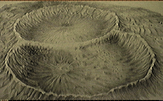
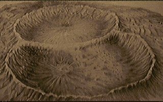
Adrian Carmack and Kevin Cloud (the artists on the team) really went to hell with transposing these. The logo going through a lot of experimentation being one example.
Title Screen#
Gallery |
|---|
                                         |
Help/Controls and Credits Screens#


Episode 1 Intermission#
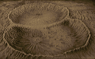
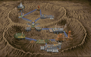
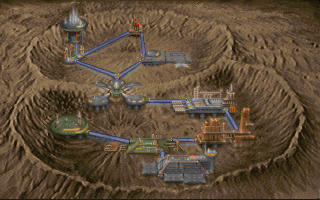
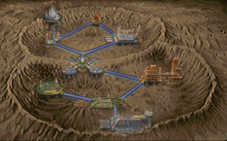
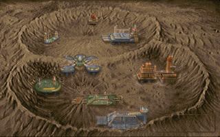

Episode 2 Intermission#
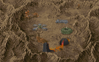

Episode 3 Intermission#
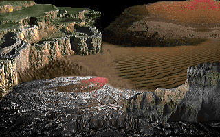
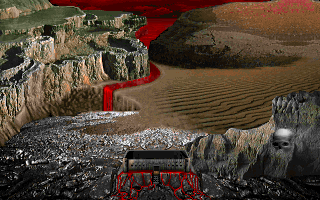
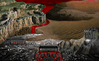
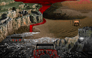
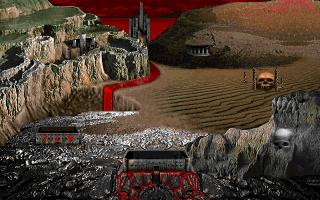
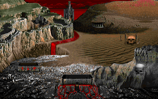
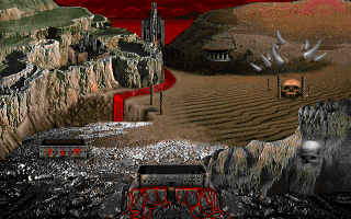
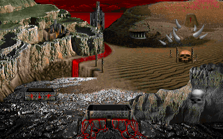
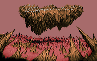
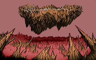
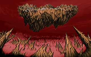
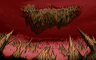
Oh dear Khan Maykr. There is a LOT of work done with Inferno. I mean, how else would you interpret Hell creatively? It would take quite a bit of time. In brief: the art team got creative with making episode 3's intermission screen, but it took quite a bit to get there.
Gallery |
|---|
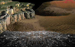 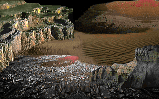            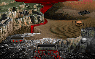 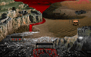 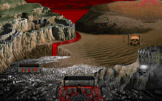 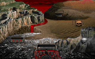     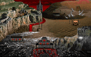             |
Episode 4/Doom 2 Intermission#
Postmortem release, and the continued The Ultimate Doom development portion of the game after Doom 2. Shame the retail release/content addition was a time crunch, otherwise we would've gotten an amazing map design for episode 4 (even if the episode was less quality consistent than the previous three).


Episode 2 Ending#
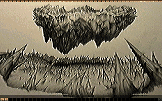
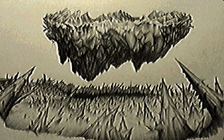
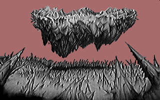
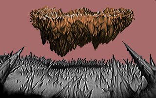
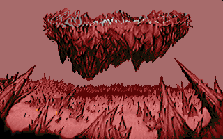
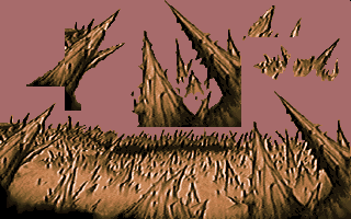
Episode 3 Ending#
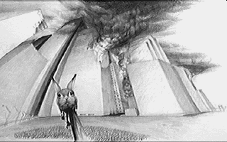
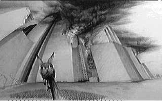
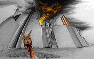
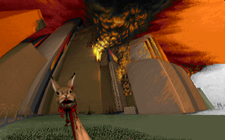
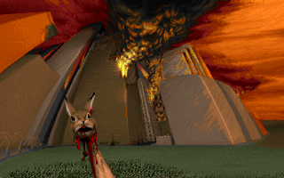
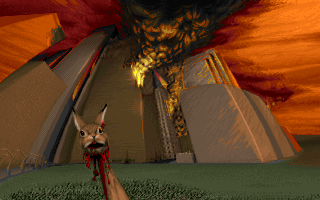

No Daisy#
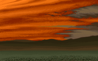
The entire background without the tragic demise of our beloved pet bunny. If only the miracle happened... well, miracle to some extent at least.
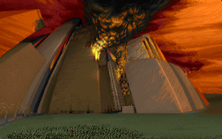
Order Screen#